The following case study shows how I led the product management and UX efforts to build a delightful reading experience readers could access on any device. the product and UX
The End Result
Before we go through the process that led there, I wanted to show where we ended up. Customers were thrilled to lock in this new reader experience and even agreed to higher monthly fees to extend their SaaS contracts.


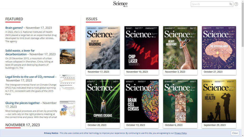
The previous year we had launched the Content Hub with great success. Magazine readers used it to find articles from recent magazine issues or from curated lists of back issue content. They could also enjoy other content from the publisher like podcasts or video.
Publishers were very excited about it… but our analysis showed that the reader experience was not seamless when users navigated between the Content Hub and the article reading experience.
The other problem was that our native mobile app framework was beginning to get outdated and couldn’t support the Content Hub experience Readers could not access the content hub from their mobile apps.
My Approach
I started by facilitating cross-functional team meetings using the Lean UX Canvas as a framework.
We analyzed publisher and reader comments. We documented the problems we are solving, who we’re solving them for, and what our desired outcomes are. We brainstormed potential solution ideas. We identified the risks and the assumptions that should be validated. I analyzed data about how our readers navigated through issues and between the issues and the content hub.
I sketched user flows and ideas for the new reading experience. I used Figma to iterate on diagrams and wireframes. I held review sessions where I got feedback on the designs from stakeholders and customers.


When we felt confident with our designs. I increased the visual fidelity and made the designs look great to showcase the beautiful content from our publishers.

I selected a few mockups to evaluate with an online unmoderated usability test on UserTesting.com. It was useful to identify some potential usability issues and get some feedback from their panel of participants.
As we narrowed down on some favorites, I created an interactive prototype and held design review sessions with customers.
I planned and moderated a series of remote usability tests over Zoom using the interactive prototype. Remote participants clicking a mobile app prototype in their web browser is not the ideal scenario, but in-person testing would have been unsafe due to the COVID-19 pandemic. We documented findings on the wiki and I spliced together a highlight reel to share with the team.
We learned a lot from the usability testing and made some good improvements. The insights from the research informed our decisions moving forward.
We sliced the work into user stories and prioritized the most valuable. I worked closely with the developers as they built the functionality piece by piece – providing specifications and requirements and reviewing work in progress. I worked with sales and support to plan a beta program. We identified the right customers to invite, and when we felt like we had a Minimum Viable Product, I initiated the beta by scheduling individual kick-off calls with the beta participants, the salesperson, and the a support representative.
We learned a lot from our first couple of beta customers. I participated in the first few sales calls to help demo and highlight the features and benefits as the sales team ramped up on the product. I listened and took notes as customers provided feedback and shared information with us about how we can help them meet their business goals with the product.
We continue to build out the ACE user experience using what we’ve learned by collaborating with our customers.
The Results
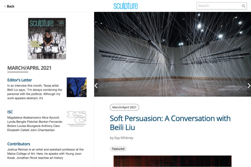
We integrated the article reading experience into the Content Hub itself, which is available on mobile and desktop browsers. We also created a mobile app that leverages the Content Hub and the ACE reading experience.
It proved to be a great opportunity to reimagine the reading experience. We made it beautiful, engaging, and customizable to meet the needs of all types of publishers.
ACE has driven a surge in sales. Customers have been excited about it and it’s allowing us to succeed in a challenging digital publishing market.
One of the top KPIs that I track is Average Reading Duration per User. So far with our beta customers, the average duration is almost double what it was on our legacy platform.


