I was thrilled when my proposal was accepted and I was invited to speak at UXPA Boston 2019. The title of my talk was “Beyond Google Analytics – Using Event-Based Tracking for UX and Product Decisions”

It was a very rewarding experience and it was very exciting to exchange ideas with some of the smartest UX thought leaders in the industry.
Presentation Summary
Here’s how I described my presentation in the UXPA Boston 2019 Conference Schedule
I’ll share some best practices I’ve learned for collecting and analyzing event-based web tracking data. I’ll also share ways we’ve used analytics data to inform product design decisions. You’ll learn how you can do the same thing at your organization.
Qualitative and quantitative user research methods are both necessary to make informed product design decisions. In the past few years I’ve implemented a few different tracking and reporting systems for quantifying the user experience with web analytics data.
Event-based tracking systems provide a deeper understanding of user behavior than traditional pageview tracking systems like Google Analytics. I’ll walk through the process of setting up event-based tracking with examples from our implementation on a CMS administration UI. I’ll share some highlights from our implementation spec and describe what worked well and what we would have done differently in our implementation.
I’ll describe the benefits we gained by collecting detailed, structured data about user engagement. We could definitively answer the questions that arise at each stage of the design and development process. We were able to follow a Lean Startup, MVP-based product development process because we completed the build-measure-learn feedback loops with real user data.
Don’t get stuck making assumptions based on anecdotes. Join me to learn how we derive actionable insights for product design from analytics data and find out how you can implement or improve your own product analytics. This presentation is geared towards UX practitioners with some familiarity with analytics.
And now for some highlights from the presentation…
Presentation Highlights

Analytics and the Design Process

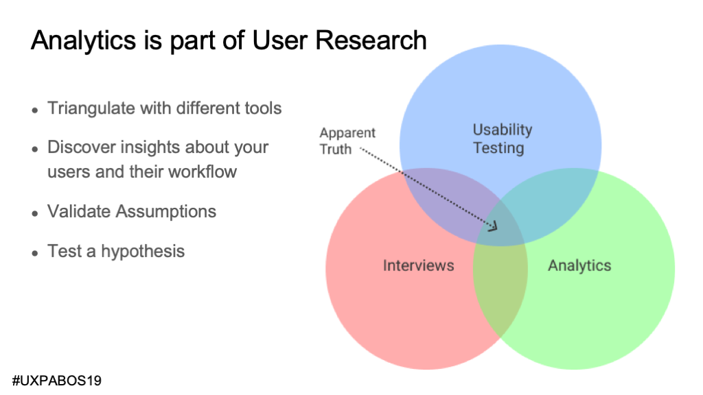
Analytics is a user research method. The best strategy is triangulating across multiple (more than just 3) different types of user research.
I love analytics data because it’s not a sample, you’re capturing interactions from almost every user. Once you implement it and understand it, it can be relatively easy and inexpensive.
Analytics tells you what happened but not why it happened.
It really complements more qualitative methods. If you hear anecdotes, you can confirm if it’s a real phenomenon. When you see something interesting in the analytics, you can interview and observe users to find out what’s going on.
We rely heavily on analytics data due to our lack of a UX research team. We use pretty small sample sizes when we do qualitative research. Our developers know how to track data and we capitalize on that.

More than with new feature planning, analytics data is most useful in validating an MVP and guiding decisions about how to improve.
It’s all about those day-to-day decisions that we are always making as product designers. Sometimes we have to make them based on gut instinct (and hopefully validate later). It’s great when we you have the data to make a more informed decision.
It’s incredibly satisfying when questions can be asked and answered right there while you’re in a meeting.
Examples
Example 1: Article Editor Workflow

This screenshot shows an article with a large gallery, a featured image, authors, and categories.
We needed data to improve the editors’ user experience. I collaborated with a developer to figure out a clever way to track a lot of data without breaking the budget by sending too many events.

What you see here is the live view in Mixpanel, great for debugging and testing tracking calls. It’s also a good way to show how we’re tracking event data for article form submissions.
We keep track all the inputs changed and links clicked while the form is being edited, and send them as arrays with the form submitted tracking call.

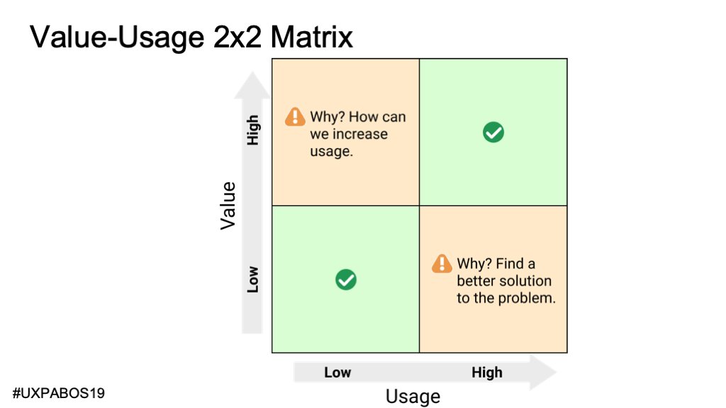
Now that we have access to a wealth of data, what do we do with it? I came up with this 2×2 matrix to clarify my thinking about this.

We want users to interact with elements are the most valuable. Among other things, we value fields that allow editors to drive engagement.
When we value a field, but it has low usage, we have to ask ourselves why.
- Maybe we should change the design – make it more prominent, to increase usage.
- Maybe our assumption is wrong and it’s not actually valuable
- Maybe it’s associated with a very important yet infrequent use-case.
These are the types of questions that can only be answered by talking to users.
When we feel like a field has low value but high usage, it may be evidence of a flaw in the design that we can fix by understanding the user’s needs better. Then again, maybe our assumption about the low-value of the field is wrong and we should adjust our thinking.
The article category selector (shown below) would be in one of those green squares in the 2×2 grid. It is highly valuable and has high usage.

68% of the time when users add or edit an article they add a category. They have a lot of categories. Based on that we knew it was a good investment to improve the field by adding grouping and a search box. the search field is used in 14.5% of the times when categories are added to articles.
The following two examples on the screenshot below would be in the orange boxes in the 2×2 grid. They demand some additional investigation.

Many customers were very vocal about this “multiple authors” feature request yet an author was added on only 1.4% of article edits. It could be that it’s a very important yet infrequent use-case.
Users changed the default setting for including the featured image in the body in 9.3% of edits. This was a surprisingly high amount of usage.
We did a remote observation usability study to help us understand the reasons for the behaviors we saw in the data analysis. It gave us a lot of context to create a prioritized roadmap of potential improvements for the article editing user experience.
Example 2: Breaking News Alerts

If you’re following an iterative MVP process, there will be times when the code, or the user interface, need to be refactored. Back in 2016, we needed both. A lot of alert customizations were added over time – especially related to links -and we ended up with something that wasn’t usable. We had various indications, but one of them was the tracking data that showed breaking news alerts were published without a link to the relevant content.


In conversations with customers we heard about the need to customize the message per alert channel at times, but that they also need to publish the alert quickly so we made the editable message part of a expandable section.
When editors publish breaking news alerts, 8% of the time, they customized the message for an individual alert channel. That seems right in line with what we expected. It seems to validate our decision to hide the channel message customization field in an expandable section.
The number of alerts sent per day increased following the MVP redesign release and subsequent iterations, indicating that we were partially successful in our redesign. However, we weren’t seeing an increase in visitor engagement with those alerts.
Shortly after improving the ux for sending alerts, We added an ‘alerts’ tab to their analytics dashboard so they could make data-driven decisions about publishing alerts.


We focused on displaying data that is actionable. We provided a chart that showed customers the best times of day to publish their alerts to maximize engagement.

The red line indicates the alert interface redesign and the green line indicates when we released the alert engagement report on the analytics dashboard. The overall alert engagement did increase significantly in the end so we celebrated our success and shifted our focus to other features.
Conclusion

Analytics data is valuable but we need to strike the right balance. I need to increase our use of qualitative methods. Some companies may need to shift in the direction of quantitative data analytics. We couldn’t have built the TV Broadcast CMS business without the analytics data.
Come up with a plan to make use of analytics data. Take some baby steps. Do a proof-of-concept. Hopefully I’ve given you some ideas here that can help.
I’d love to continue this discussion. Please contact me with any feedback or questions.
Still want more? The entire slide deck for Beyond Google Analytics: Using Event-Based Tracking for UX and Product Decisions is also available for download.
